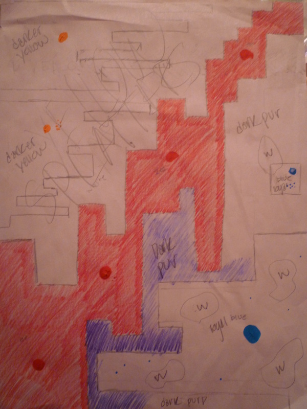
For my second draft I wanted to keep the red stair like design going through the middle of my paper. This represented the violin run very well I thought and it was the only thing I really liked about my first draft. For the bottom part I wanted the same dark colors the royal blue with the dark purple background. I felt like these colors represented the darkness and richness of the piano cords. For the design I made a blocky structure coming out of the bottom side of the page with one block floating above representing the highest note played by the piano. I then added some splotches of brown to show the banging on the piano chords. On the top part I did the same idea as the bottom a sideways block structure but I made the blocks thinner to show that the notes of the violin part were quick. The colors I decided to use is a golden yellow for the block like thing a white background and light yellow splatters all over to show the chaos of the part.

 RSS Feed