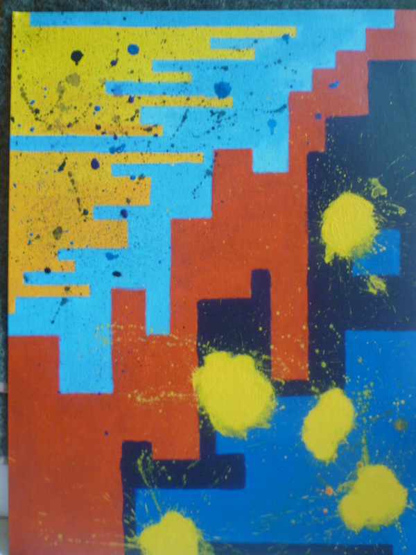
As I started my final I was still unsure of the exact colors I wanted to use on my piece. I knew I wanted to use the design I created and I wanted to use red for the center area. I decided to start with these places first. I measured the ratio the board to the paper as two to one so everything in my sketch has to be doubled in size I used a ruler to make sure all my lines were perfectly straight and in proportion. The thickness of the different lines represents the pitch of the notes being played for that part. The next day I painted the red area I had to do two coats to make the red an even tone without any canvas poking through. I then started on the top part I put yellow down then I decided I wanted it to blend down like a flowing color like the violin part so I blended from yellow to orange. To contrast this and provide some extra chaos to the part I put down a light blue paint next to it. Then I splattered tiny dots on top. For the bottom I chose to use a royal blue and a dark purple do show how dark, low and rich the piano chords are the yellow spots represent the banging popping out cords the piano player has.
 RSS Feed